Design DNA
Key takeaways
- Design Style
- Not available
- Brand Vibe
- Not available
Image 1 of 5
USD 26.29
$ 26.29
Listing notes
Specs
Product visuals
Design DNA
Packaging & Form
Audience & Context
Branding Signals
### **PACKAGING & FORM:** - **Packaging Type:** The packaging is a glass bottle, specifically designed to hold Pernod Aniseed French Apéritif. - **Materials:** The primary material is glass, known for its sturdiness and ability to preserve flavor, color, and aroma. The cap is metallic, which is a typical choice for sealing beverages to maintain freshness. - **Surface Finish:** The bottle features a clear, glossy finish that allows the vibrant green liquid within to be highly visible. This glossy treatment adds an element of shine, enhancing its visual appeal. The cap also exhibits a glossy silver finish. - **Shape and Form Language:** The bottle has a traditional cylindrical form, slightly tapering towards the base. This classic shape is visually appealing and provides a comfortable grip. The neck of the bottle is longer than standard, giving it an elegant look, and the base is rounded, with a slightly wider opening that contributes to its distinctive silhouette. - **Size Indicators and Perceived Size Class:** The bottle is sizable, holding 1 liter of liquid. It stands tall and is substantial in hand, indicating it’s intended for sharing or social gatherings rather than individual usage. - **Components:** The bottle features a simple metallic screw cap that is silver in color, which implies that it is easy to open and close for real-time usage. There is a subtle embossed design on the cap with the brand’s logo, further enhancing the user experience. ### **COLORS & AESTHETICS:** - **Dominant Colors:** The predominant colors are a bright emerald green for the bottle and a striking red for the "PERNOD" text. Additional colors include white for text and embellishments and silver for the cap. - **Color Mood and Overall Palette:** The color palette is vibrant and eye-catching, with a mix of bold colors that create a lively and appealing aesthetic. The brightness of the green adds a refreshing feel to the design. - **Warmth/Temperature of Colors:** The colors lean towards a cool temperature, particularly the green, complemented by the warmer red elements, creating a balance that feels both refreshing and inviting. - **Contrast Levels:** There is a high level of contrast between the white text and illustrations against the green bottle background, as well as between the bold red "PERNOD" and the clear bottle, making it easy to read and visually striking. ### **DESIGN STYLE:** - **Overall Design Style:** The design follows a modern yet slightly vintage style, reminiscent of classic apéritif bottles with a contemporary twist. The structure and typography suggest sophistication, making it appealing yet approachable. - **Brand Positioning Signals:** The vibrant colors and refined design suggest a premium positioning in the market. The long-standing history indicated on the label (since 1805) adds to the brand's prestige and artisanal nature. - **Emotional Tone Conveyed:** The overall tone is elegant and celebratory, inviting occasions such as gatherings, parties, or relaxed evenings. It evokes feelings of nostalgia with a modern touch, suggesting quality and craftsmanship. ### **TYPOGRAPHY & TEXT:** - **Font Styles Visible:** The brand name "PERNOD" is rendered in a bold, sans-serif typeface that is slightly rounded, conveying robustness and reliability. The supporting text uses a cleaner sans-serif style, enhancing readability. - **Typography Mood:** The typography feels bold and confident, ensuring brand recognition while remaining classy. - **Label Density:** The bottle has a moderate amount of information, balancing aesthetics with necessary product details. The label design is clean, with necessary information legibly presented without clutter. - **All Readable Text, Claims, and Product Information:** Prominently displayed text includes "PERNOD" in large red lettering, "PARIS" just below it, and “PRODUCT OF FRANCE” at the top arc of the label. The alcohol content is stated as “40% vol” while additional cities listed show global reach, enhancing the premium narrative. ### **GRAPHIC ELEMENTS:** - **Icons and Symbols:** There are decorative flourishes surrounding the text, with intricate scrollwork that conveys classic elegance. Additionally, the emblematic circular logo at the top of the label prominently displays “PERNOD” and a date that anchors the product's history. - **Certification Badges:** There are no visible certification badges on the packaging, keeping the focus primarily on branding. - **Brand Logos and Their Prominence:** The "PERNOD" logo is the most prominent graphic element, taking center stage on the label, while the other texts and designs serve to complement it. - **Decorative Elements and Patterns:** The bottle features delicate, vintage-style borders and flourishes that enhance its sophisticated appeal while keeping it visually interesting without overwhelming. ### **TARGET & CONTEXT:** - **Perceived Target Audience:** The target audience appears to be adults who enjoy premium alcoholic beverages, likely appealing to both genders, particularly those with a taste for classic cocktail culture. - **Where This Would Fit Contextually:** This product fits well in social contexts such as bars, restaurants, and home entertaining scenarios. It's suitable for a kitchen or bar cart display and is ideal for use in mixed drinks or as an aperitif before meals. - **Seasonal Associations:** The vibrant colors and celebratory nature of the apéritif suggest an association with festive occasions, suitable for summer gatherings and holiday celebrations. ### **QUALITY INDICATORS:** - **Perceived Premium Level and Quality:** The clear glass and elegant design convey a high-quality product with an artisanal backstory, suggesting careful craft and a premium experience. - **Material Feel and Texture Perception:** The smooth glass surface of the bottle feels premium and luxurious in hand. The metallic cap adds further tactile richness, signaling quality. - **Transparency Level of Packaging:** The bottle’s clear glass allows for a full view of the emerald liquid, enhancing consumer confidence in the product's quality while suggesting freshness. - **Overall Aesthetic Appeal:** The combined use of color, typography, decorative elements, and quality materials leads to a very appealing package that attracts attention on shelves and conveys style and sophistication.
Adds one unit to your SkyBuyFly bag. Safe retailer fill starts only from the bag after reviewed consent.
Airport availability
Availability and prices come from airport retailer listings.
Pickup, delivery, and stock depend on the linked retailer.
Retailer policies
Returns and warranty terms are set by the retailer you order from.
Checkout handoff
SkyBuyFly stops before retailer checkout, payment, or order placement.
Listing provenance
Offer source
Available airport rows identify the retailer source associated with each link.
Comparison context
Use the displayed airport, currency, captured price, and update time when available when comparing offers.
Purchase boundary
SkyBuyFly stops before retailer checkout. Final availability, purchase, payment, and terms remain external.
Baseline
Baseline order. Sign in and explicitly opt in to use saved preferences.
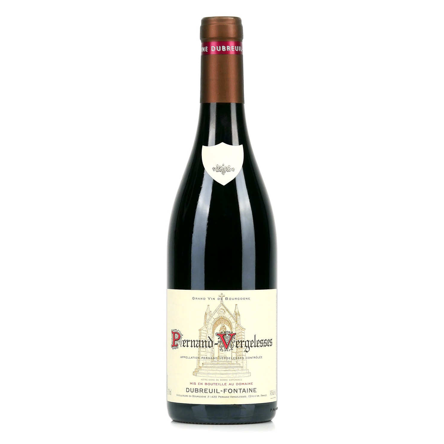
Current price USD 59.09
Why ranked: Baseline catalogue order — personalization is off.
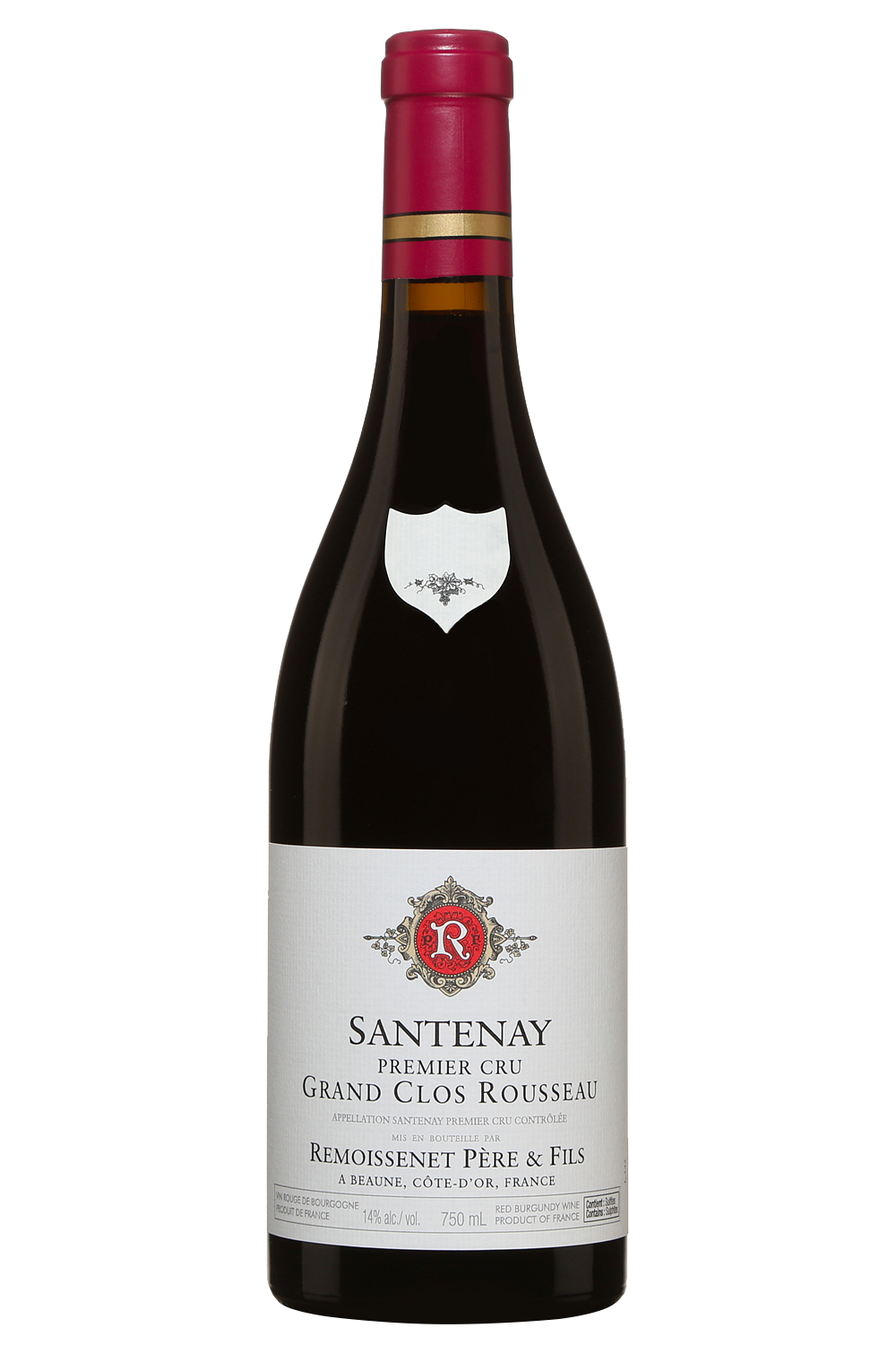
Recorded price USD 62.36
Why ranked: Baseline catalogue order — personalization is off.
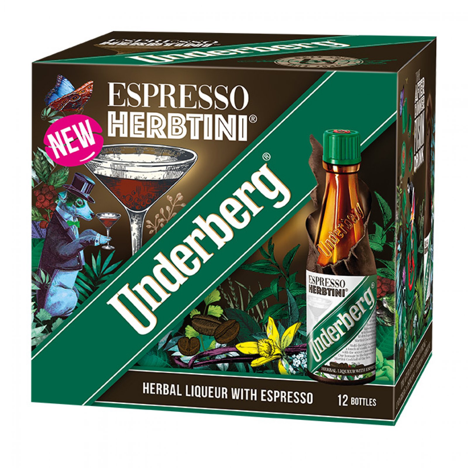
Recorded price USD 8.14
Why ranked: Baseline catalogue order — personalization is off.
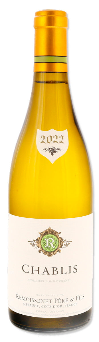
Recorded price USD 42.21
Why ranked: Baseline catalogue order — personalization is off.
Finding similar products...