Design DNA
Key takeaways
- Design Style
- Not available
- Brand Vibe
- Not available
Image 1 of 5
USD 29.11
$ 29.11
Listing notes
Specs
Product visuals
Design DNA
Packaging & Form
Audience & Context
Branding Signals
### PACKAGING & FORM: 1. **Exact Packaging Type:** - The product is contained in a cylindrical bottle with a rounded, slightly tapered base and a seeming angular top, which provides an overall sleek silhouette recognizable in body care products. 2. **Materials:** - The primary material appears to be high-quality plastic, featuring a semi-opaque finish. The cap is constructed from metal, likely an aluminum alloy, which gives it a durable and premium feel. 3. **Surface Finish:** - The body of the bottle exhibits a matte surface finish, providing a soft touch that feels inviting. The metal cap has a polished, glossy finish that contrasts beautifully against the matte body. 4. **Shape and Form Language:** - The body of the bottle has a softly curvy tapering profile that enhances ergonomics for handling. The overall shape culminates in a gently rounded top, which contributes to an organic and modern aesthetic. 5. **Size Indicators and Perceived Size Class:** - This 250 ml bottle fits comfortably within the mid-size category for body lotions, suggesting ample supply for regular use without being bulky. It is easily portable yet substantial enough for countertop display. 6. **Components:** - The bottle is equipped with a screw-on cap that has a secure twist mechanism, ensuring product integrity and protection from spills while making it easy to dispense lotion without losing the lid. ### COLORS & AESTHETICS: 1. **All Dominant Colors:** - The color palette primarily features a soft pastel pink for the bottle, which symbolizes femininity and delicateness. The floral accents and label include a light pink, soft green, and contrasting white for the text and details. 2. **Color Mood and Overall Palette:** - The use of pastel colors creates a serene, calming mood, suggesting a gentle, nurturing body care experience. The overall palette leans towards cool undertones. 3. **Warmth/Temperature of Colors:** - The pinks are warm but subdued, enhancing the reassuring, gentle vibe without being overly bold, while the white elements maintain a clean, fresh feel. 4. **Contrast Levels:** - There is a balanced contrast between the soft pink of the bottle and the white lettering on the label, which makes the text easily readable without overpowering the floral graphics. ### DESIGN STYLE: 1. **Overall Design Style:** - The design can be classified as modern vintage, combining contemporary elements with nostalgic charm through the use of floral designs, evoking the essence of Provence. 2. **Brand Positioning Signals:** - L’Occitane’s branding leans towards the premium artisan market. The aesthetics imply high quality and craftsmanship, targeting discerning consumers looking for luxury and experience rather than just functionality. 3. **Emotional Tone Conveyed:** - The overall tone is elegant and gentle, promoting calmness and self-care, likely appealing to individuals seeking relaxation and indulgence in their body care routines. ### TYPOGRAPHY & TEXT: 1. **Font Styles Visible:** - The typography features a mix of serif font styles for the product name “Fleurs de Cerisier” written in an ornate, flowing script that evokes a sense of beauty and craftsmanship. The product descriptor “Lait Corps Éclat” uses a clean sans-serif font. 2. **Typography Mood:** - The font choices convey elegance and sophistication, especially with the script which adds a personal touch, while the sans-serif maintains clarity and modernity. 3. **Label Density:** - The label features a clean and moderate density of information, providing essential product details and claims without overwhelming the viewer. 4. **All Readable Text, Claims, and Product Information:** - The front label reads “Fleurs de Cerisier Cherry Blossom” prominently at the top, followed by “Lait Corps Éclat Brightening Body Lotion,” succinctly informing the customer about the product's function. ### GRAPHIC ELEMENTS: 1. **Icons and Symbols:** - The bottle incorporates graphic elements of delicate cherry blossom flowers, with soft lines and subtle details enhancing the packaging’s appeal. This graphical representation adds a touch of nature and authenticity. 2. **Certification Badges:** - There are no visible certification badges on the front of the packaging, suggesting a focus primarily on aesthetic and brand heritage rather than organic or cruelty-free claims. 3. **Brand Logos and Their Prominence:** - The L’Occitane logo is subtly placed on the lower part of the label, maintaining brand identity without overpowering the intricate floral design. 4. **Decorative Elements and Patterns:** - Decorative flourishes around the floral motifs offer a vintage feel, which aligns with the brand's heritage and enhances the charm of the presentation. ### TARGET & CONTEXT: 1. **Perceived Target Audience:** - The design and color palette suggest that the primary audience is feminine, targeting women who appreciate beauty, luxury, and personal care indulgences. 2. **Where This Would Fit Contextually:** - This product is likely to fit well in environments such as bathrooms, vanity spaces for personal grooming, or gift baskets for special occasions, lending a touch of elegance to the home. 3. **Seasonal Associations:** - The cherry blossom motif evokes springtime, suggesting freshness and renewal, making it appropriate for seasonal promotions or as a gift during the spring season. ### QUALITY INDICATORS: 1. **Perceived Premium Level and Quality:** - The combination of the high-quality materials, elegant design, and tasteful color choice conveys a high level of perceived quality and suggests that this is a premium product. 2. **Material Feel and Texture Perception:** - The matte body of the bottle feels smooth and soft to the touch, enhancing tactile engagement which is often associated with high-end products. 3. **Transparency Level of Packaging:** - The semi-opaque material allows consumers to see the product level, which is a quality indicator for body lotions, suggesting transparency and honesty in brand practice. 4. **Overall Aesthetic Appeal:** - The entire presentation appeals to the senses, drawing consumers in with its elegant design and sophisticated graphical elements, culminating in a visually memorable package that stands out on retail shelves.
Adds one unit to your SkyBuyFly bag. Safe retailer fill starts only from the bag after reviewed consent.
Airport availability
Availability and prices come from airport retailer listings.
Pickup, delivery, and stock depend on the linked retailer.
Retailer policies
Returns and warranty terms are set by the retailer you order from.
Checkout handoff
SkyBuyFly stops before retailer checkout, payment, or order placement.
Listing provenance
Offer source
Available airport rows identify the retailer source associated with each link.
Comparison context
Use the displayed airport, currency, captured price, and update time when available when comparing offers.
Purchase boundary
SkyBuyFly stops before retailer checkout. Final availability, purchase, payment, and terms remain external.
Baseline
Baseline order. Sign in and explicitly opt in to use saved preferences.
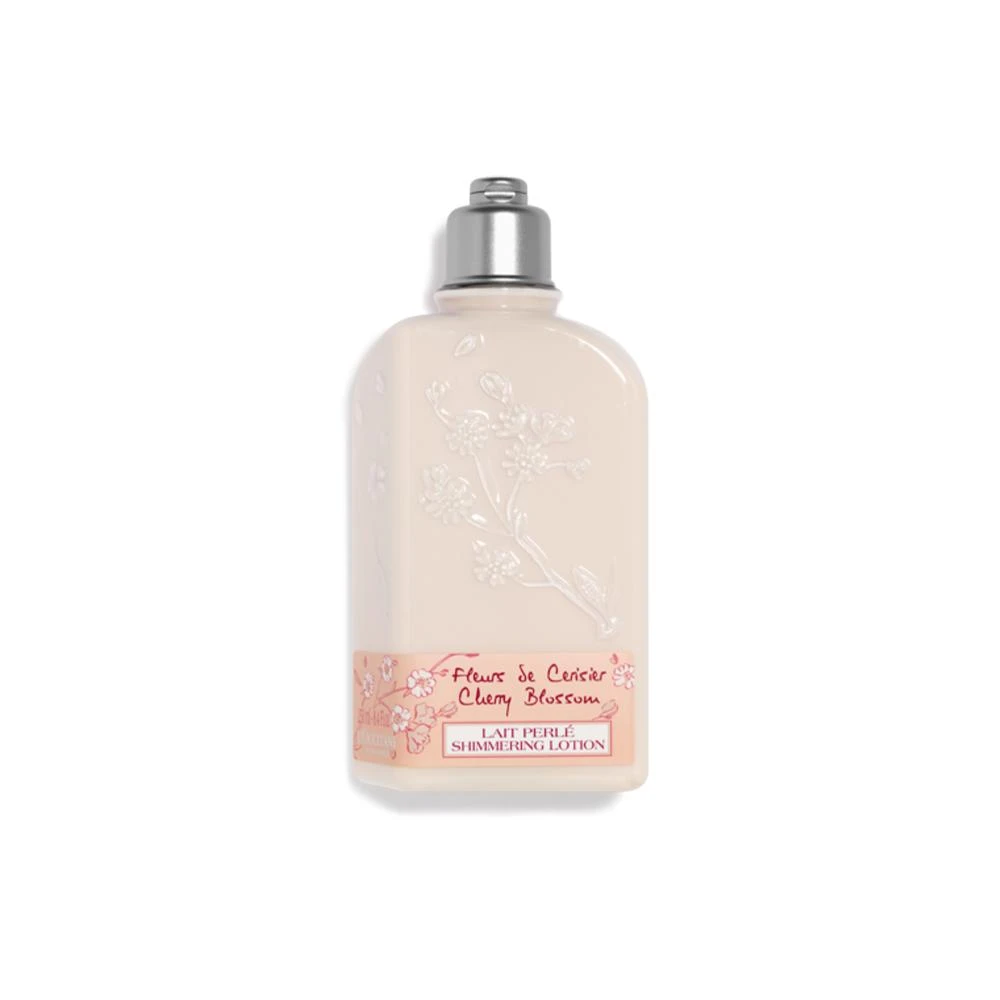
Recorded price USD 31.00
Why ranked: Baseline catalogue order — personalization is off.
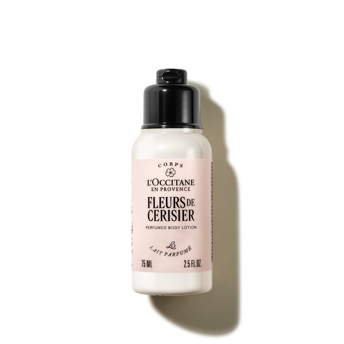
Recorded price USD 27.92
Why ranked: Baseline catalogue order — personalization is off.
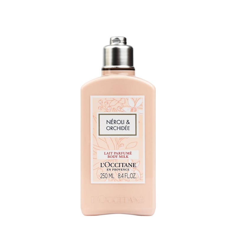
Recorded price USD 30.62
Why ranked: Baseline catalogue order — personalization is off.
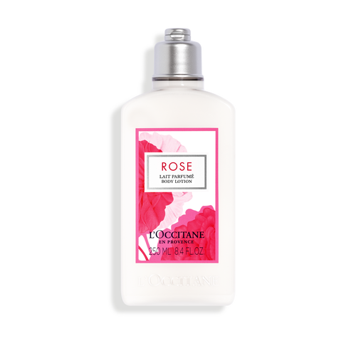
Recorded price USD 23.71
Why ranked: Baseline catalogue order — personalization is off.
Finding similar products...